


Please Login to comment on this post.

 How Can I Split a Large Design using Enthusiast?
 Dot Alphabet
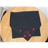 Placement Marking
During Covid-19 self-isolation, I was asked to do a couple of towels for a neighbor. I don’t ordinarily take in work, just occasionally. In the past, my neighbor has come over and told me what she wanted and we picked out colors and sketched out ideas together. This time, I put more distance into the process.
First I asked how many she wanted done -- (the stitching takes the most time of all), and I asked what her deadline was.
I asked for a drawing of what she had in mind. She emailed it to me:
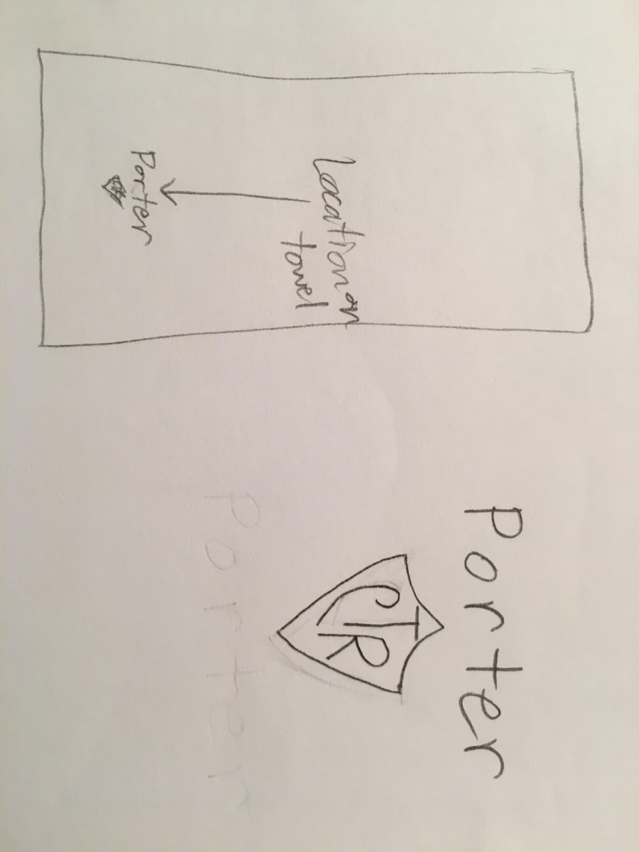
She included a note on where she had found artwork of the shield. When people ask you to embroider something, they often assume that you can take a picture or graphic image and stitch it on your machine. In this case, I have Embrilliance StitchArtist, and felt confident that if I couldn’t find a suitable embroidery file already made (my first choice) I could create one of my own.
On to the lettering. I needed to know what the names would be and how big she wanted the lettering. This we did by text message.
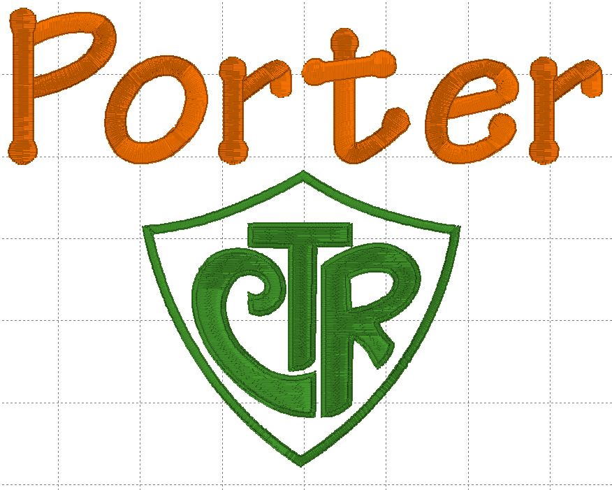
I went looking for the shield, already digitized, and I found it on SewCanShe. There, Caroline has a floral version and an applique version of the same design. I chose the applique version, and just stitched without any applique fabric, doing the shield’s stitched parts in green.
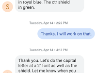
Now that I had the design, the names, the sizes, and the colors, I chose a 2" font from my list (Dot Alphabet) and created a draft for the layout. I sent Stephanie a sample screenshot.
She said she would prefer a font “without dots” and suggested Helvetica or Cambria fonts, neither of which I had for embroidery at the moment. Rather than match exactly, I tried working with what I had, so I sent her some choices: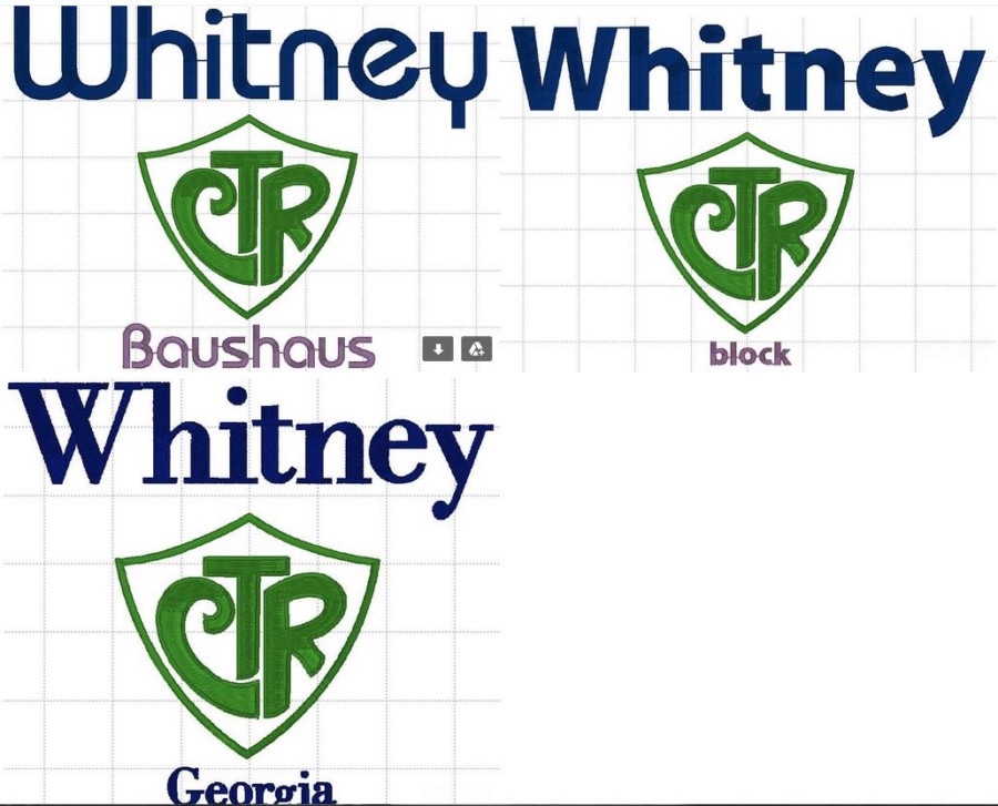
The top two are included with Embrilliance Essentials. The last one is Georgia from Rivermill. She chose the block font version. It’s a native Embrilliance font, so I can increase the size to 2” easily. Fantastic.
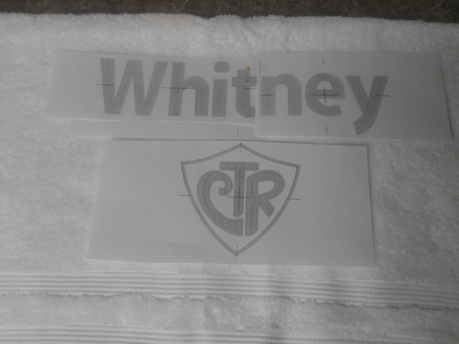
I laid out the designs. It was clear that I was going to need to do at least two hoopings per layout. That being the case, I decided to do the CTR shield separately from the names rather than try to split straight down the middle from top to bottom, or something like that.
I used Embrilliance Essentials to print an actual sized production sheet for CTR, with the center point marked.
I still wanted to limit the number of hoopings (reduces the production time for me), if I could. When I first typed “Porter” in the software, it was so very close to the limit, and I found that it was possible, with the tools in Embrilliance Essentials, to squeeze it a little, and get it to fit in my 7” embroidery area without compromising the height or looking cramped. Essentials allows me to decrease the size of the gaps between typed letters, and that was my main tool here.
Again, I used Embrilliance Essentials to print an actual sized production sheet for CTR, with the center point marked.
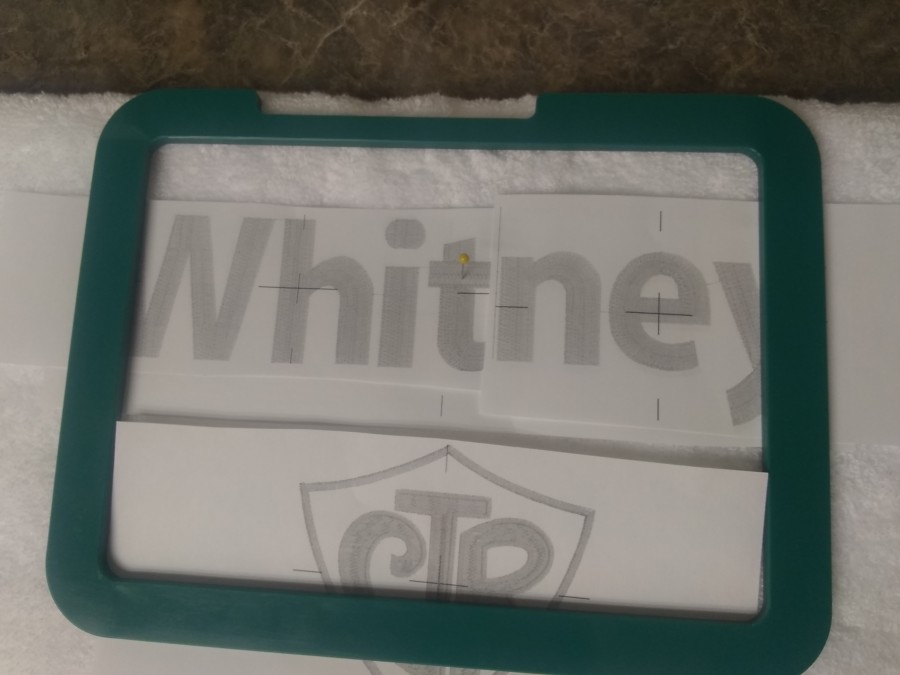
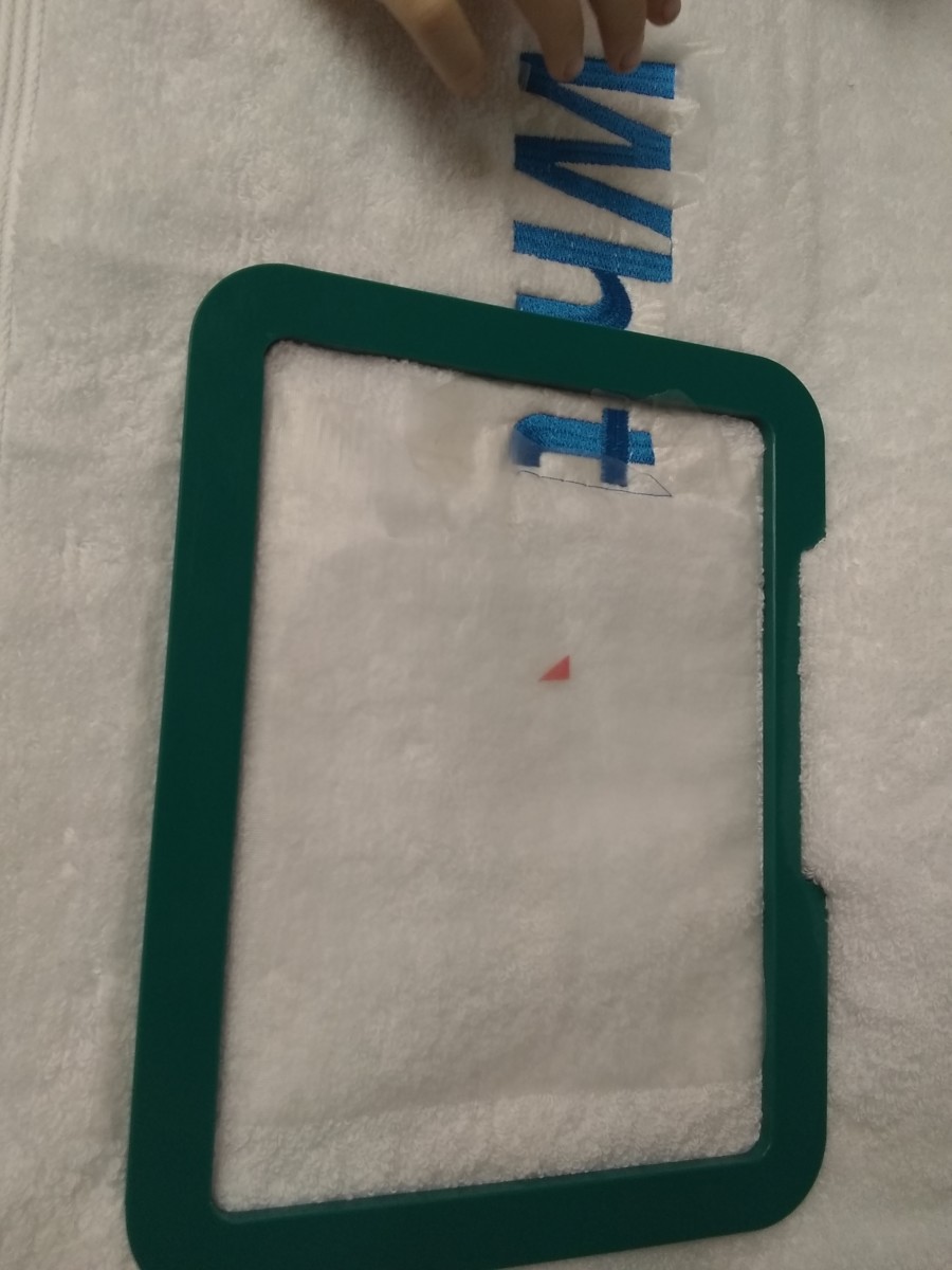
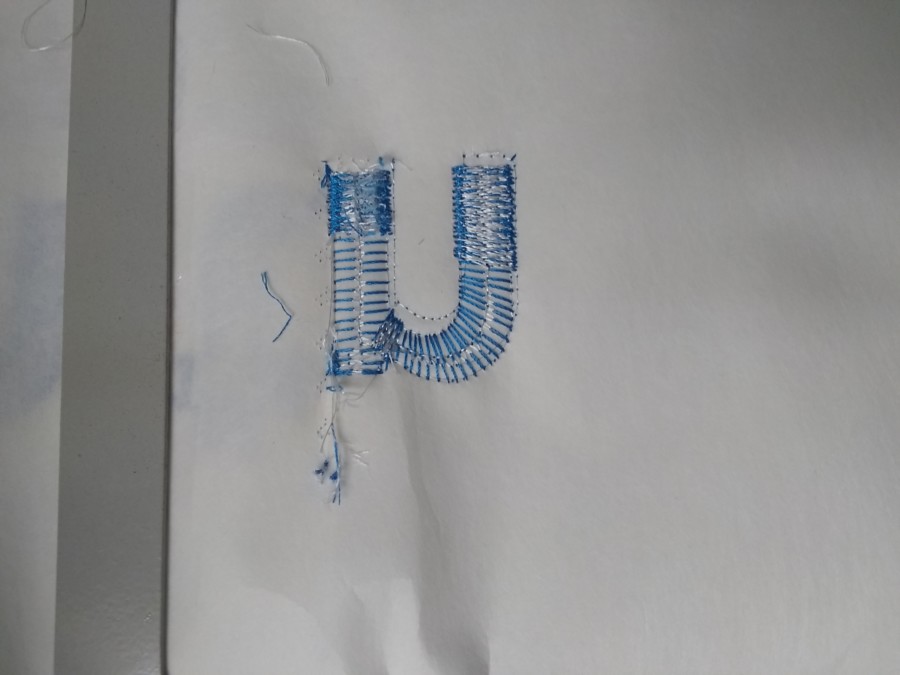
Whitney was a different story -- it was necessary to split into two parts. I arranged the letter spacing similar to Porter, so that side-by-side they looked similar, but that wasn’t enough to make the name fit in my seven inches. Splitting was going to be necessary. I used the same technique that Lisa Shaw demonstrates in her Lord Byron quote video to split Whitney into two parts with Embrilliance Enthusiast. I followed the advice to use alignments that are available. I only used the vertical one. If I did it again, I would use a horizonal alignment as well. I also stitched the alignments in the same color as the lettering. Again, if I were to repeat this process, I would have used a different color for the alignments. Why? It will automatically stop my single-needle machine before going on to the lettering. I will also stitch the first alignment and the second one in different colors from each other. That will make it a little easier to adjust the placement, since I’ll be able to tell quickly which line of stitches was the original.
Once again, I used Essentials to print the production sheet. But because Whitney was in two pieces, I printed three sheets. Three? One with the whole name (even though that doesn’t fit in my hoop), and two for the parts.
Lastly, I printed production sheets of both layouts, combined. This was for the customer’s ease. She isn’t going to understand or really care that I have to do this in pieces. What’s relevant for her is that the placement matches her expectation. As a bonus, I can use those sheets to check my alignment and placement for each part relevant to the others at the machine.
I was ready for towels, so I set up an order station on my front step. I’m sorry I don’t have a picture of it for you. It was truly a thing of beauty. My station consisted of a chair with a basket on it. In the basket were the production sheets, a bag of thread spools to choose from, and a jar for final thread selections, some pins, and instructions. I wanted Stephanie to pick out the particular shades of green, orange, and blue for her towels. I also wanted her to pin the production sheets onto the towels to further give me an idea of her placement wishes.
Once Stephanie had done that, it was up to me. I retrieved the order station and towels from my front step. I used my production sheets to select placement. Then I used the pin and sticker technique to mark placement on the towel. I didn’t have target stickers or placement dots, so I just used some other stickers, cut to size.
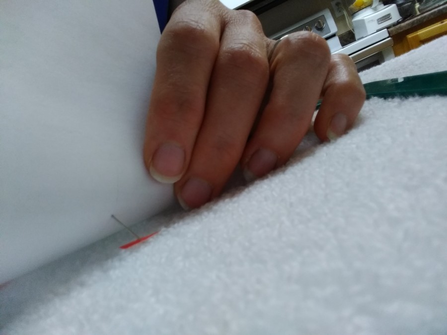
When using sticker placement markers on towels, you’ve got to align the design start point at the machine, then remove the sticker before adding the topping, or else you can wind up stitching through a sticker. For the health of your machine, that is never recommended.
Are you curious about my hoop? I used the Snap Hoop Monster, which I really like for projects on thick media that require multiple alignments. The hoop grips solidly, but is easy to re-position when I want to. It also doesn’t leave an obvious hoop mark on a towel.
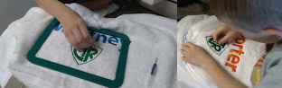
The towel for Porter was fairly straightforward, as all I needed to do was to center the two designs, spacing them correctly and keeping the towel straight.
For Whitney, it was a little more complex since I had to align to parts of the same design.
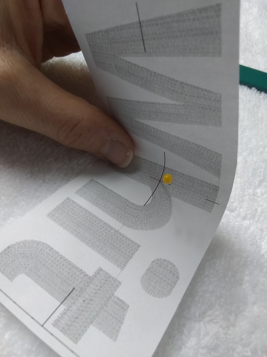
After the first part stitched, I used my production sheets, laid over and aligned with the existing stitching to confirm the placement of the second and hoop that area.
As you can see, the center point for the second half of the design is lower than for the first, since the tallest letter is shorter, and the ‘y’ makes the design lower as well.
At the machine, as I stitched the second alignment, I began to wish I had added a horizontal alignment to aid me in getting the towel perfectly positioned for the second half of the word. I also realized that having the first alignment stitched in a different color would have helped a lot.
And I even had a moment of chagrin, when I thought I had it “close enough”, and then realized I was wrong and had to remove the stitches. For that I used a seam ripper to slice the bobbin thread. I was relieved that the stabilizer eases the process of stitch removal by protecting the nap.
Now you might be wanting to ask me what stabilizer I used. Since it’s a towel, I reasoned that it would need to stand up to repeated washings, and used a cutaway stabilizer with two layers. It’s equally possible that it’s going to be kept in a special place and never used, in which case it won’t really matter after the fact, what I used.
I also decided that if I did this again, using an applique design without actually making it an applique, I would use Embrilliance Essentials to edit out the parts of the design that were specific to applique, to simplify the stitching process.
The stitching and aligning and hooping altogether took about five hours, and then it was time to trim the top threads, trim the stabilizer and pull off the topping, in that order. Trimming top threads is much simplified with the topping still in place.
I brought in an ad-hoc finishing crew for that last bit. That is to say, my children pulled off the clear topper.
After that, I arranged for a time to deliver the finished product. Stephanie was happy with it, and I hope that Porter and Whitney were, too.